Product Shoot & Label Design
VODELLI
A premium visual identity and product story for a modern pasta pantry brand — built around rich colour, crafted details and appetite-led photography.
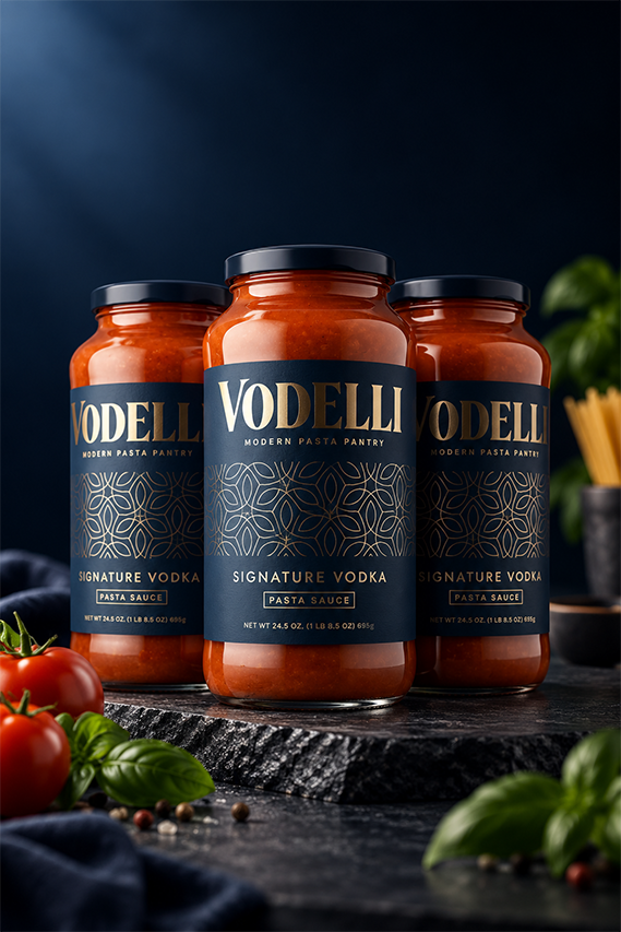
A premium visual identity and product story for a modern pasta pantry brand — built around rich colour, crafted details and appetite-led photography.
VODELLI was imagined as a modern pasta pantry brand with a premium personality. The visual direction needed to feel luxurious and distinctive while still communicating food, craft and everyday cooking.
The goal was to create a system where the packaging and photography felt like they belonged to the same world.
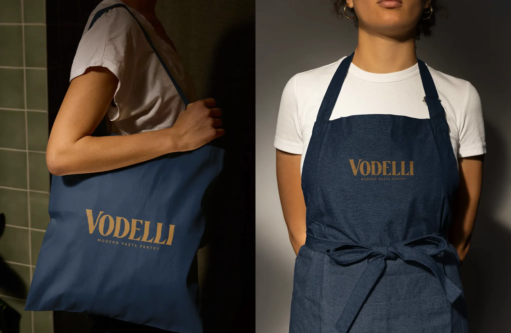
Deep navy creates the foundation. Warm gold introduces a crafted, premium character. The tomato-red product becomes the natural source of energy and contrast.
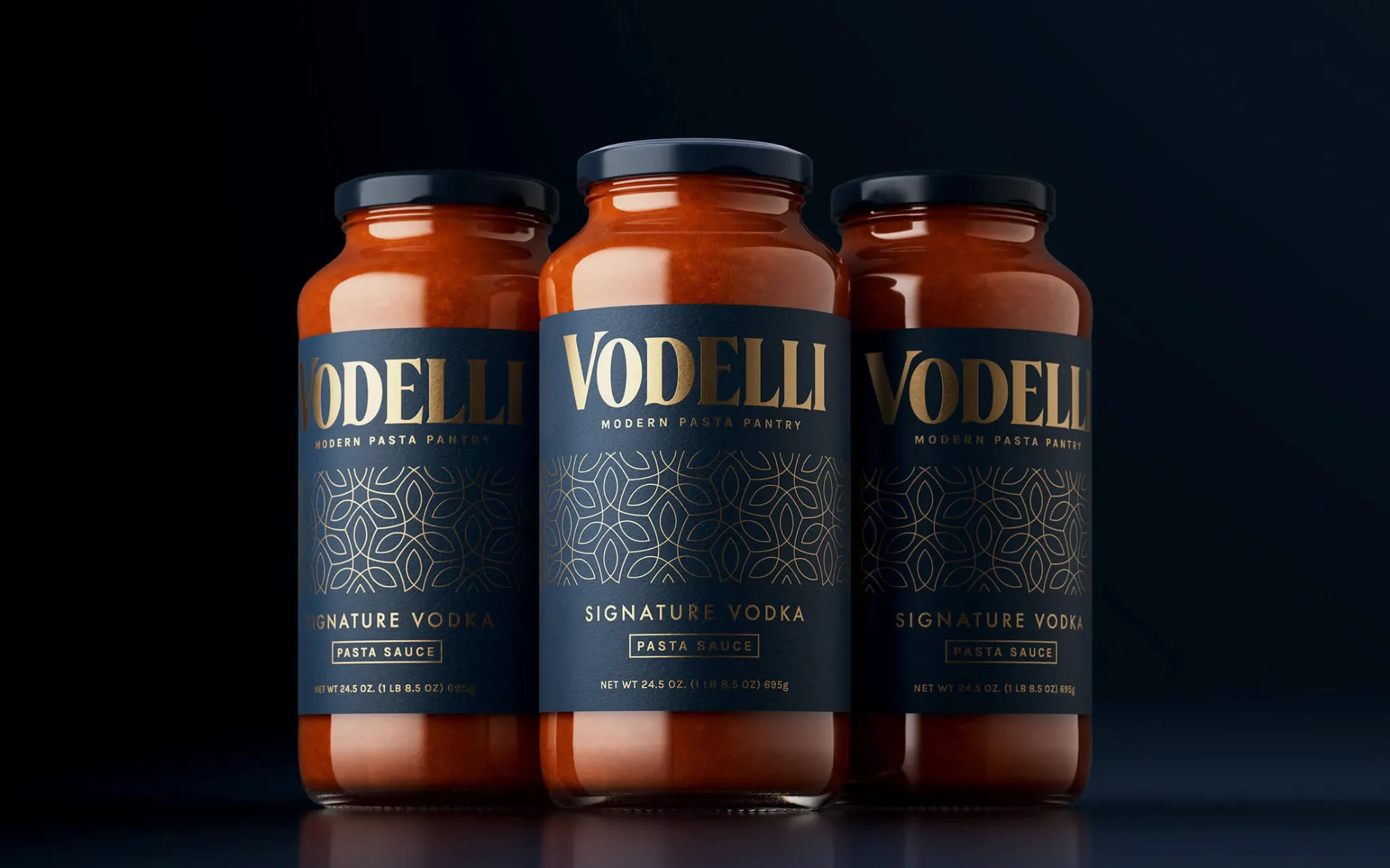
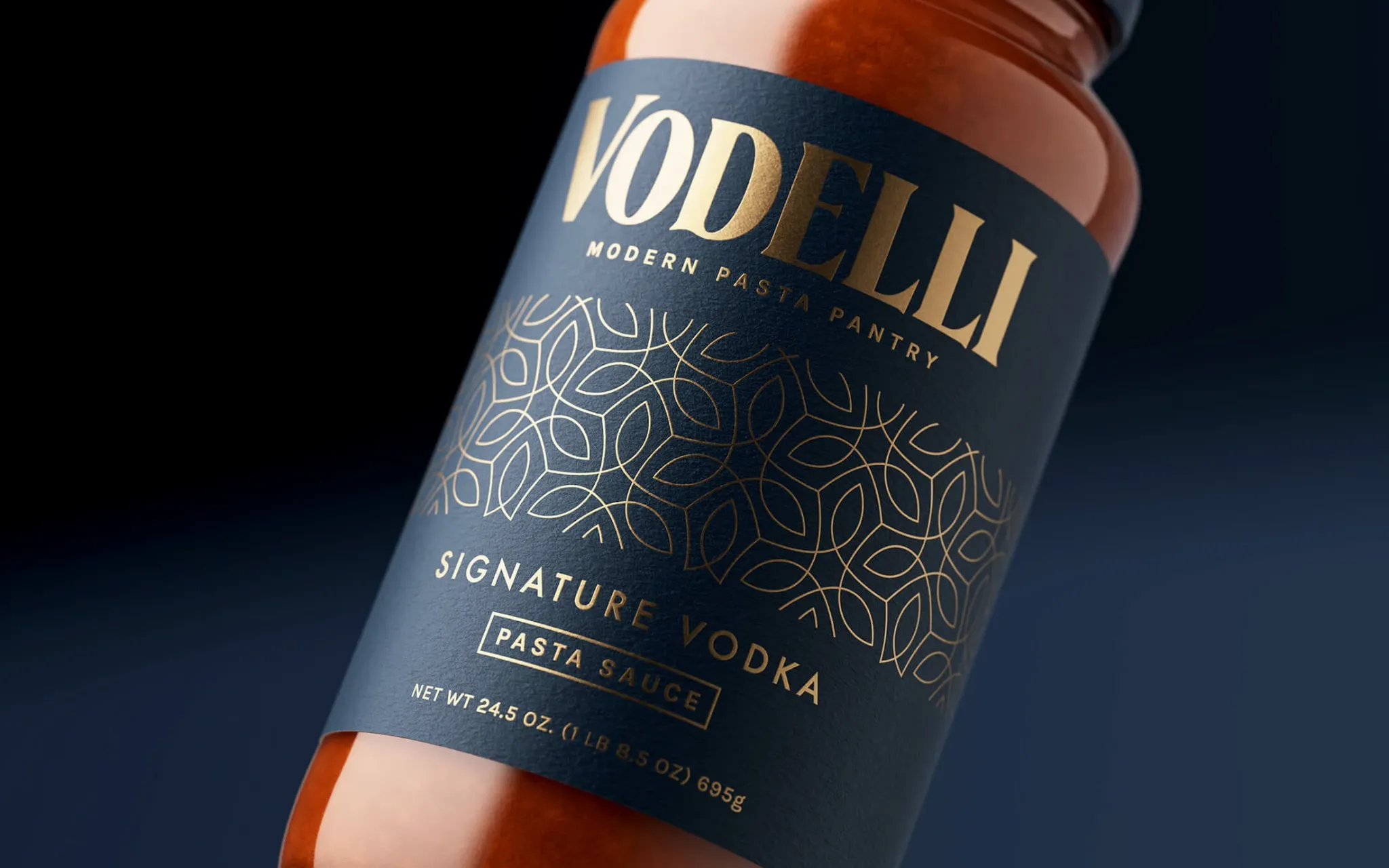
The oversized serif wordmark creates recognition, while the ornamental pattern adds detail and a sense of craftsmanship. Supporting information stays restrained so the product name remains the hero.
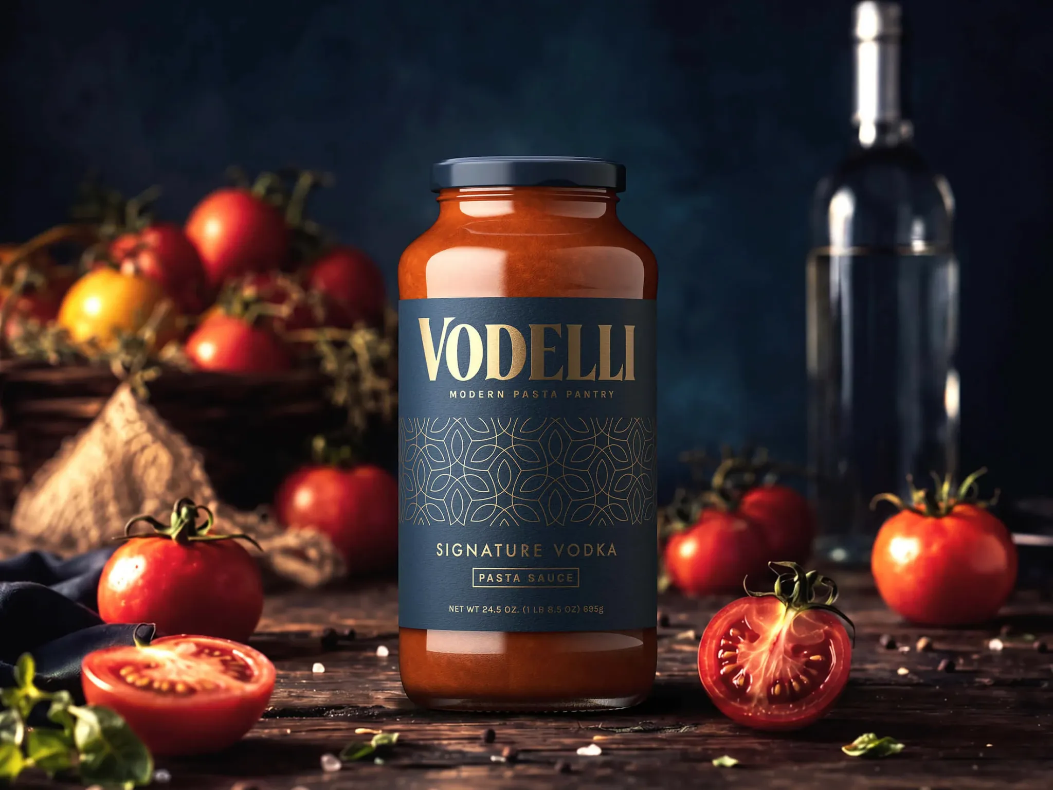
The photography was designed around the same visual language as the packaging: dark, warm and premium. Ingredients become supporting characters while the jar remains the unmistakable hero.
The navy-and-gold identity extends naturally beyond the jar into staff and lifestyle applications, keeping the brand recognisable wherever it appears.
Identity, packaging and photography come together as one visual story — premium without losing its appetite appeal.