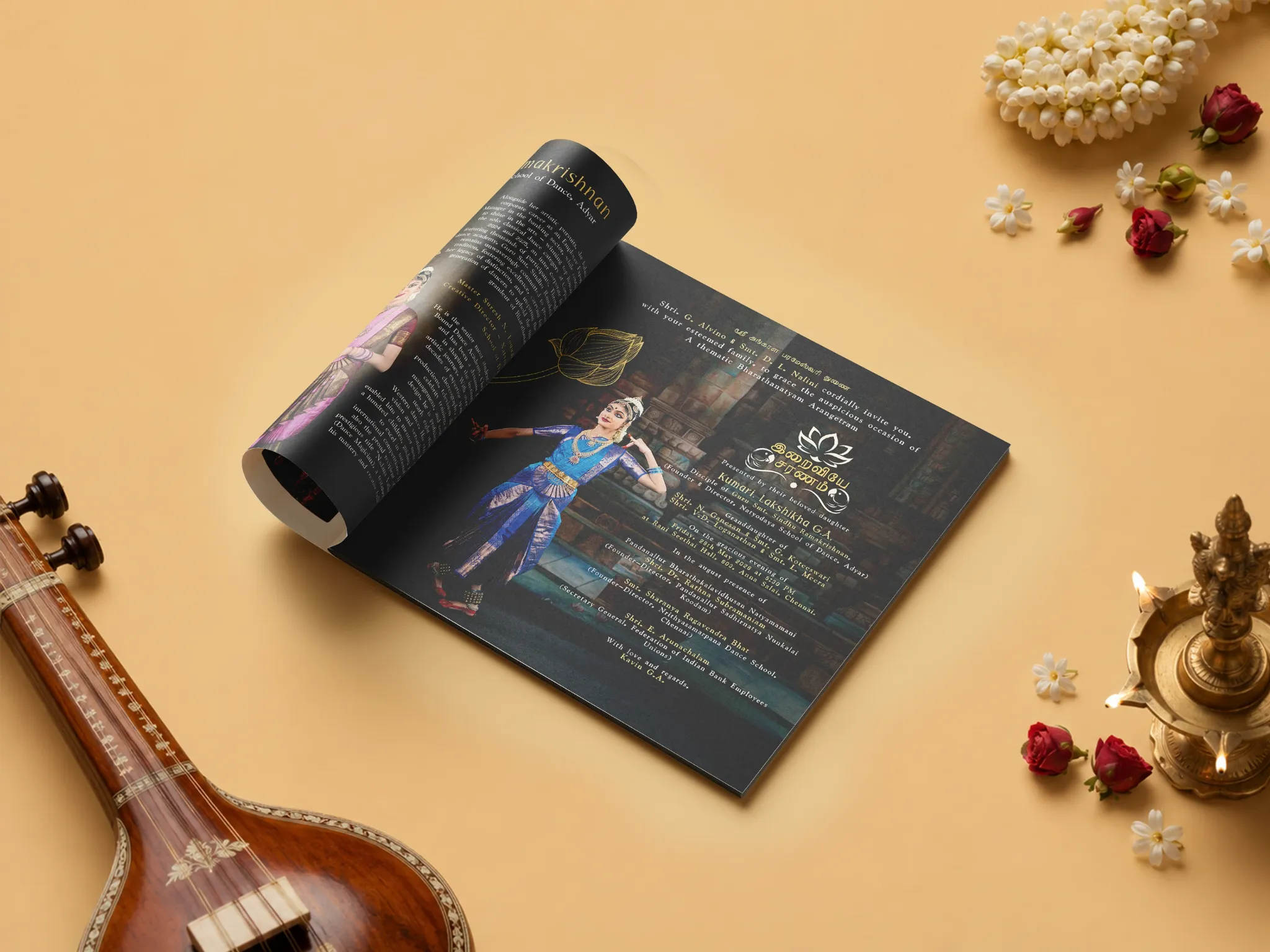
Branding & Brochure Design
A story told
through movement.
A graceful editorial brochure designed to celebrate the heritage, discipline and timeless artistry of Bharatanatyam.
A graceful editorial brochure designed to celebrate the heritage, discipline and timeless artistry of Bharatanatyam.
This brochure was created as a visual celebration of Bharatanatyam — bringing together dancers, stories, performances and cultural details in one cohesive editorial experience.
Instead of treating the brochure like a collection of information, the design approaches it like a performance — building rhythm through imagery, typography, composition and moments of visual pause.
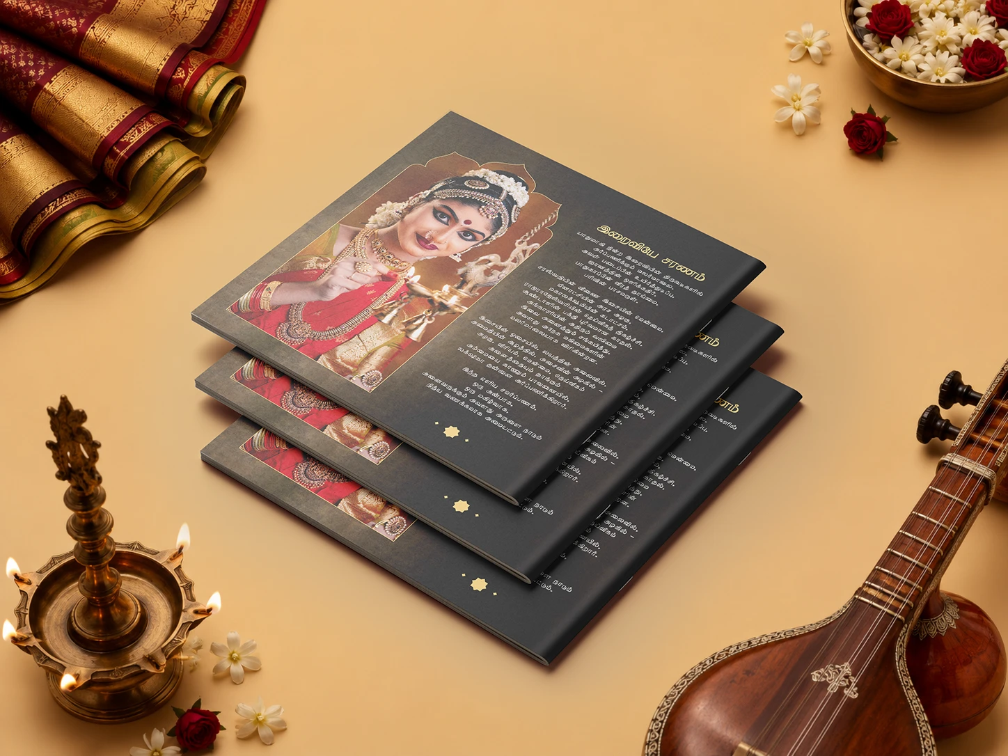
Deep charcoal surfaces, warm gold accents and expressive photography create an immediate sense of occasion.
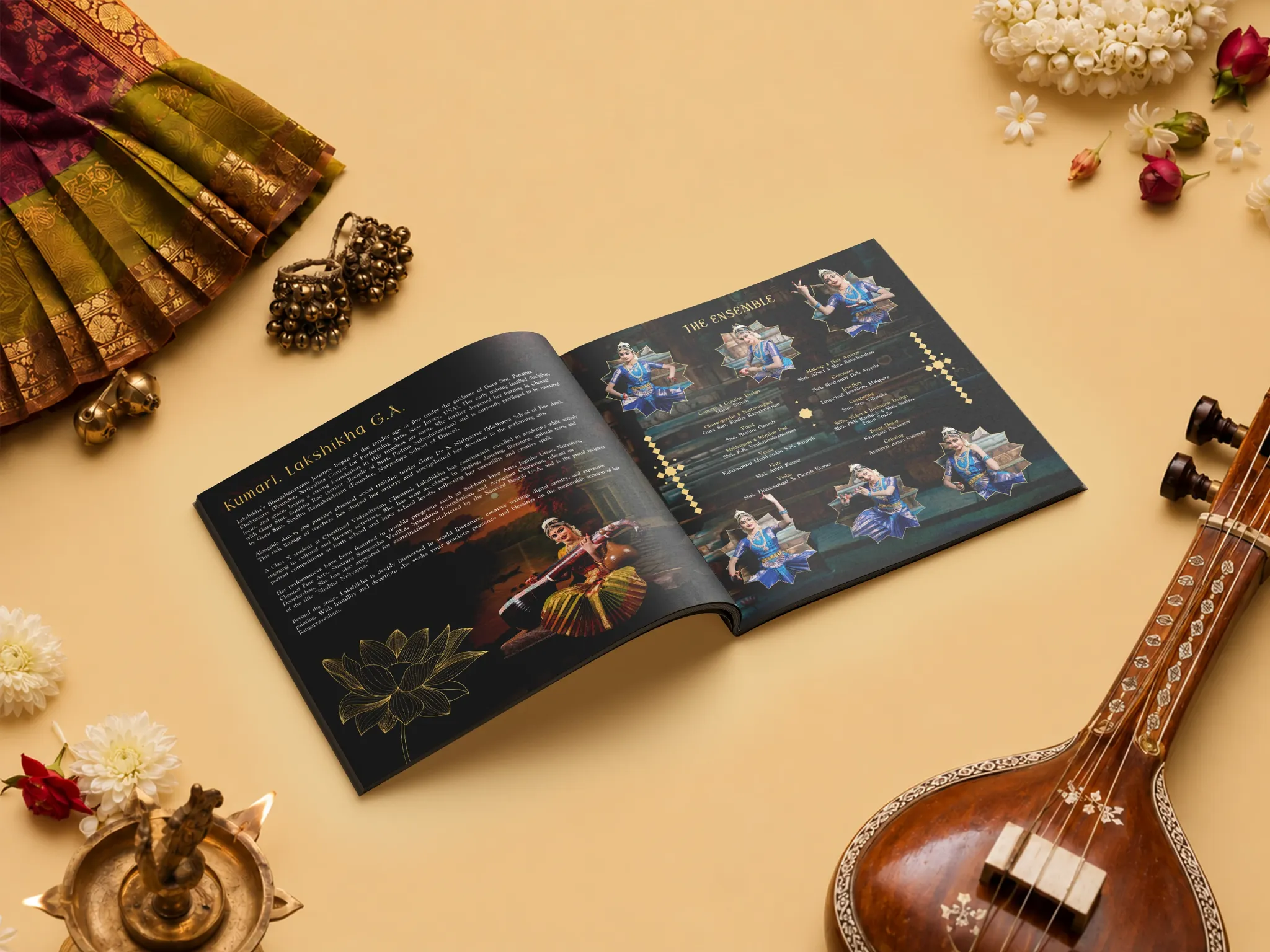
Editorial content is balanced with large imagery, dancer portraits, decorative motifs and carefully controlled typography. The pages feel immersive while keeping the information structured and readable.
The visual system uses a restrained palette so the performers and photography remain the emotional centre of the brochure.
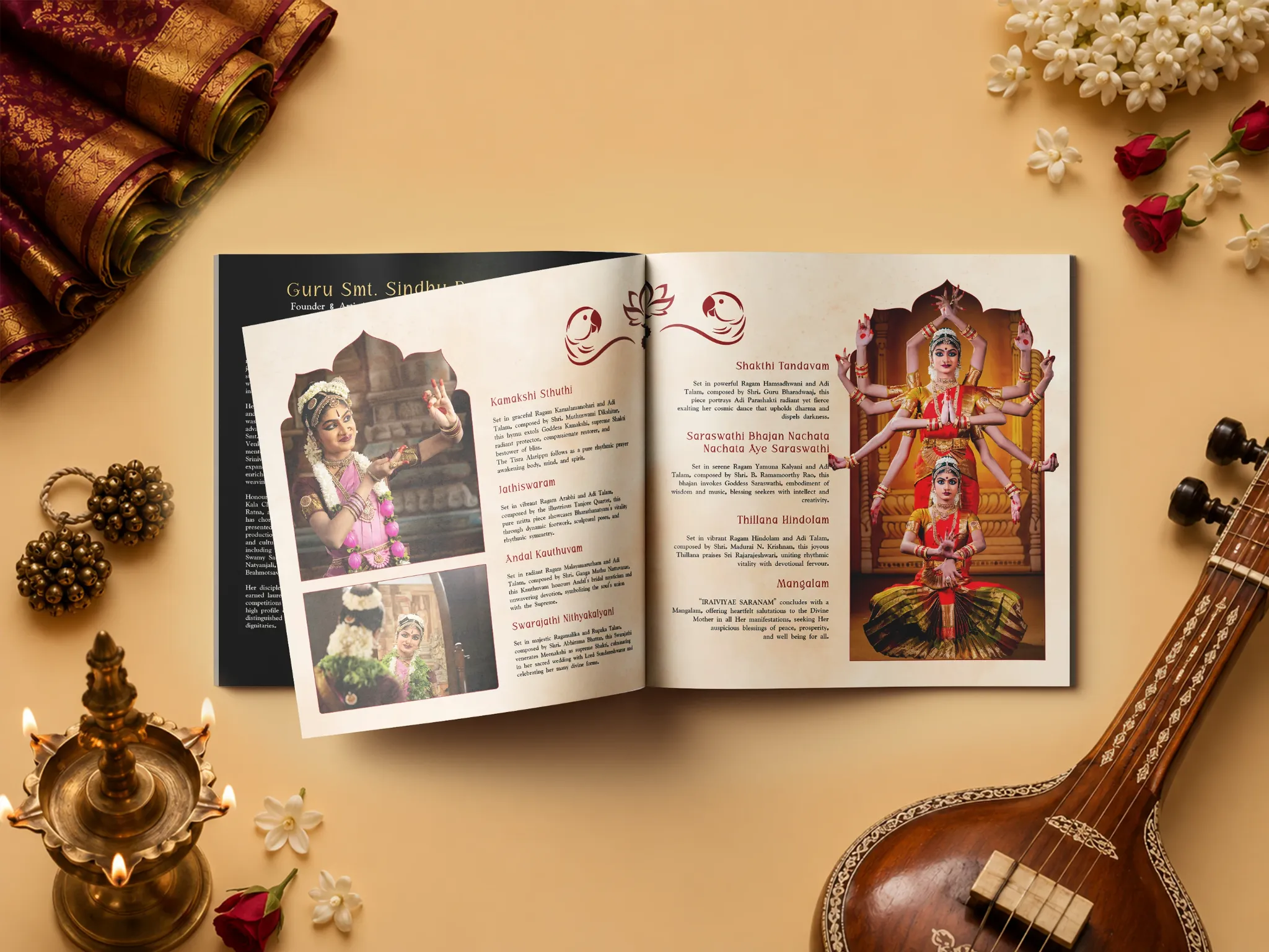
The final brochure brings cultural depth and modern editorial design together in a format that feels respectful, premium and visually engaging from cover to cover.
It was to give the story enough space to breathe. The dancers, performances and heritage remain the heroes; typography, colour and composition work quietly around them to create a cohesive experience.