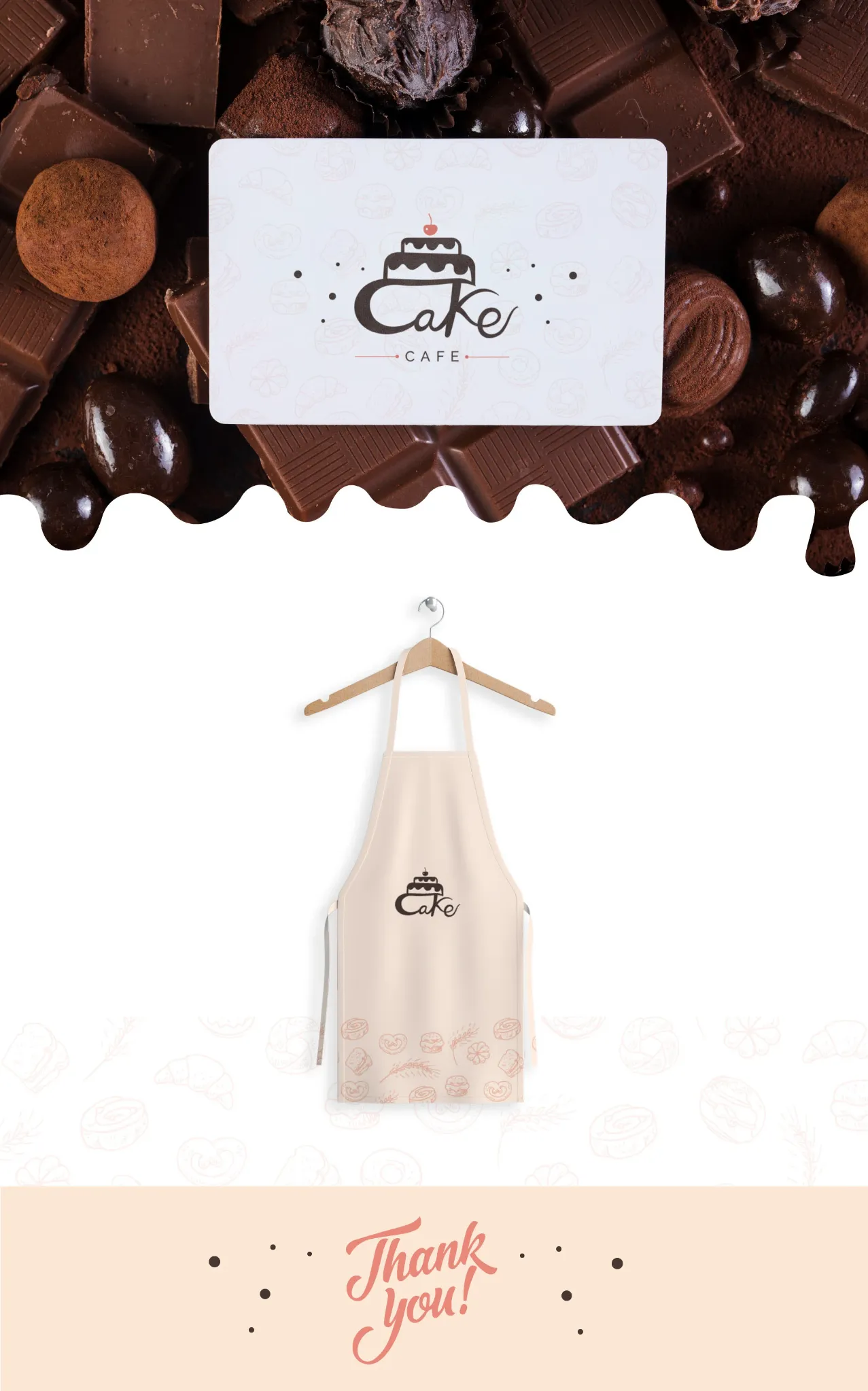
Logo Design & Branding
Sweet ideas.
Happy places.
A playful brand identity created to bring warmth, sweetness and personality to a modern café experience.
A playful brand identity created to bring warmth, sweetness and personality to a modern café experience.
Cake Café was developed around a simple idea: create a brand that feels approachable, cheerful and memorable across every customer touchpoint.
The identity was designed to feel instantly familiar — a little playful, a little handcrafted, and warm enough to belong in a neighbourhood café. The cake-shaped mark becomes the central character of the brand.
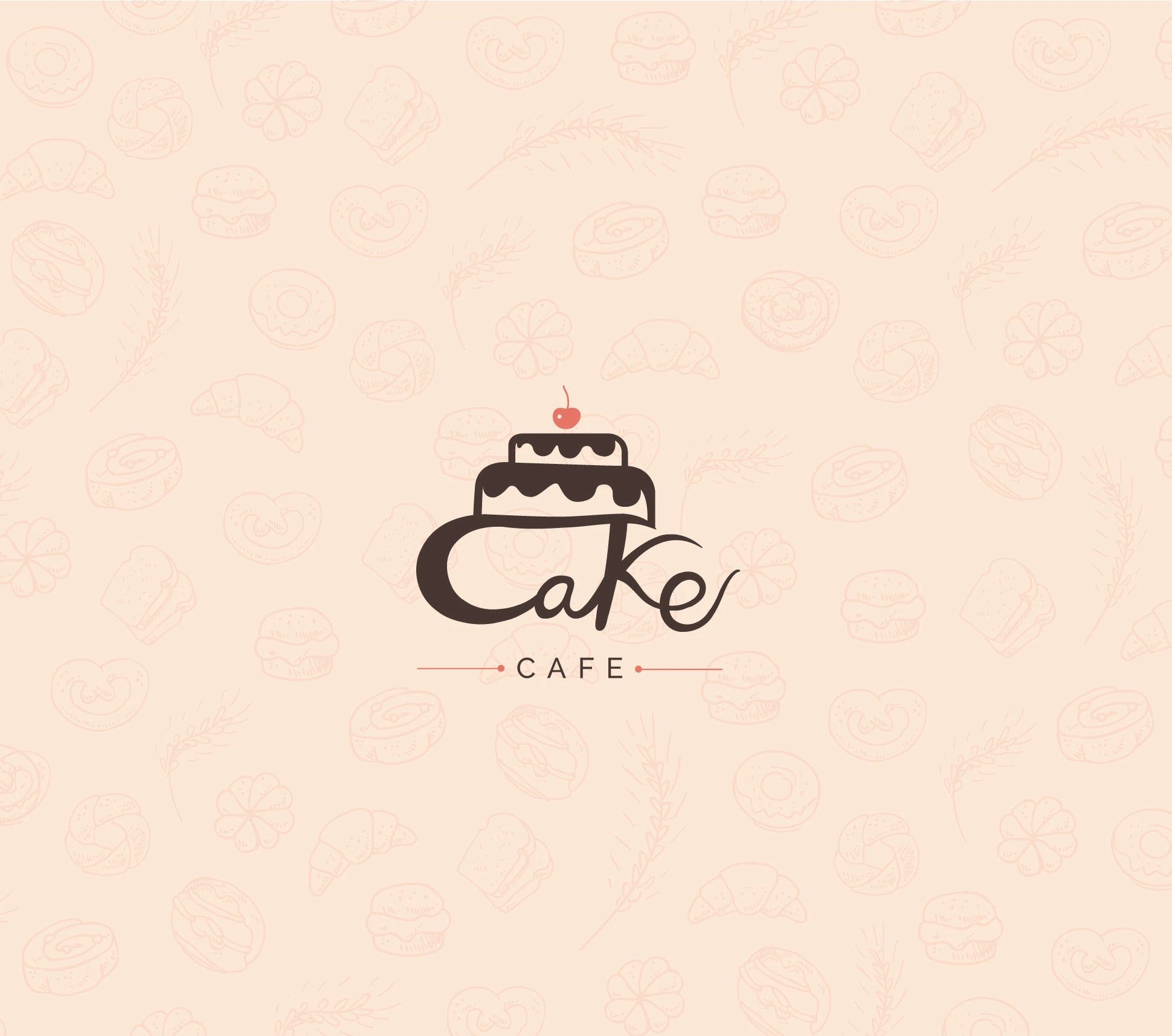
The wordmark combines a soft, expressive script with a simple cake illustration. Small details — the cherry, icing and fine divider lines — make the mark feel cheerful without becoming childish.
A repeat pattern built from bakery-inspired illustrations extends that personality into the wider identity.
Warm neutrals create the welcoming base, while coral adds energy and gives the identity a recognisable accent.
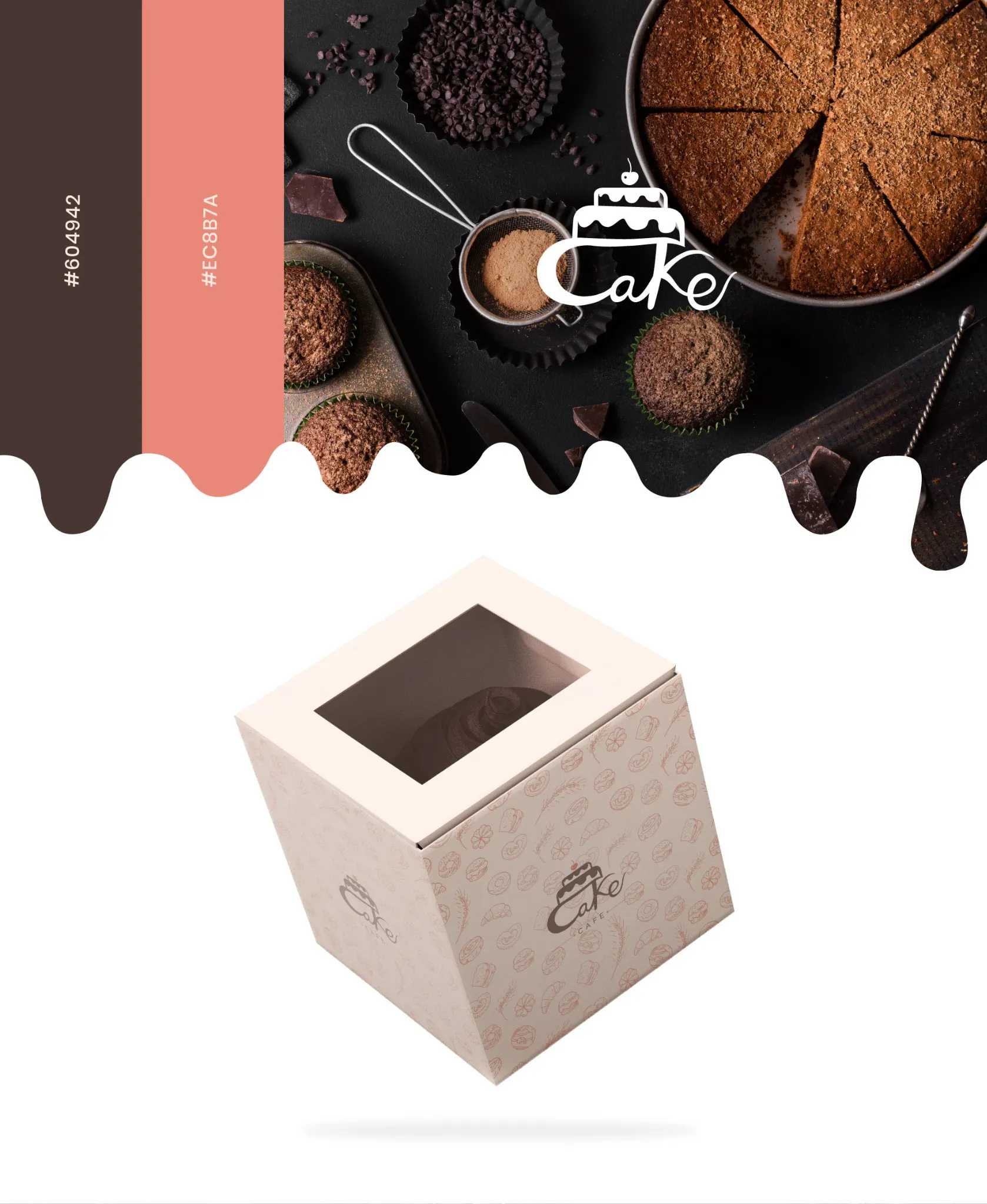
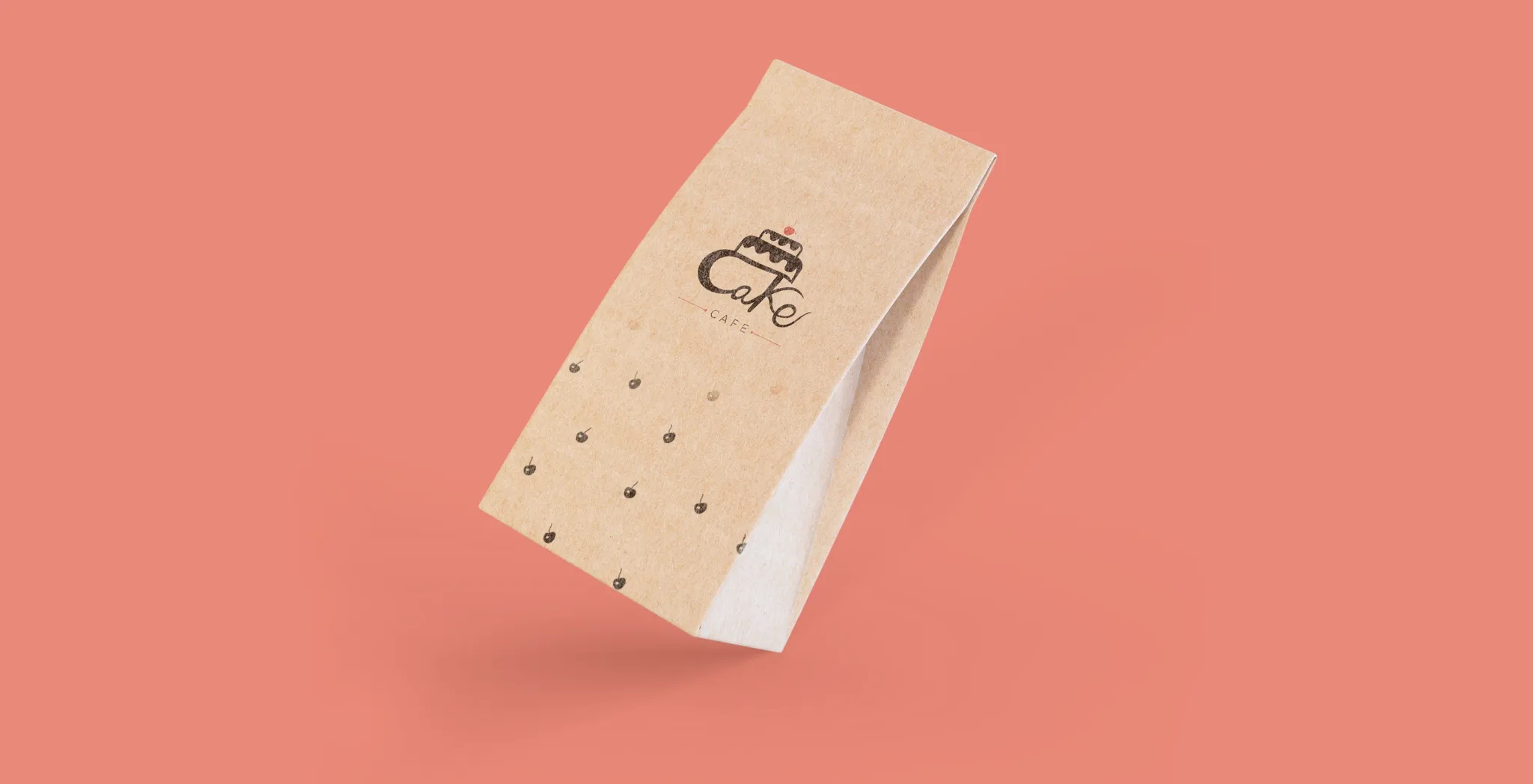
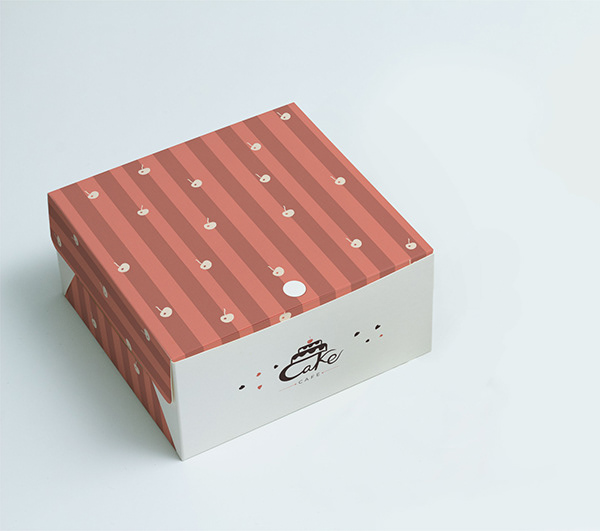
The illustration pattern gives every package a consistent visual signature while keeping the main logo easy to recognise.
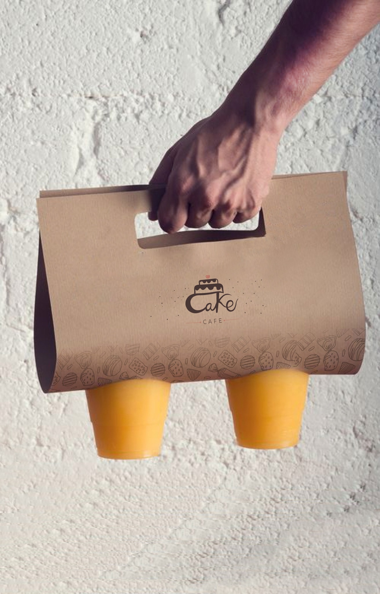

Bakery shapes, pastries and simple hand-drawn details form a flexible pattern that can scale from bags and boxes to cards, cups and in-store communication.
The final identity brings the logo, colour, illustration language and packaging together into one warm and recognisable café experience. It is playful enough to feel memorable, but simple enough to work across everyday applications.